
Visual balance interiors
Visual balance interiors is a core concept that every homeowner designer and real estate professional must understand to create spaces that feel comfortable intentional and complete. When a room has visual balance the eye moves naturally from one element to another without jarring stops or a sense of awkward emptiness. In this article we explore what visual balance means in interior design why it matters and practical steps you can take to apply these concepts in homes listed on your site or in properties you stage for sale. For more design inspiration visit metropropertyhomes.com where curated examples highlight how balance changes perception of value.
What is visual balance in interiors
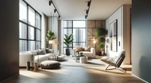
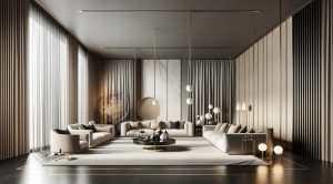
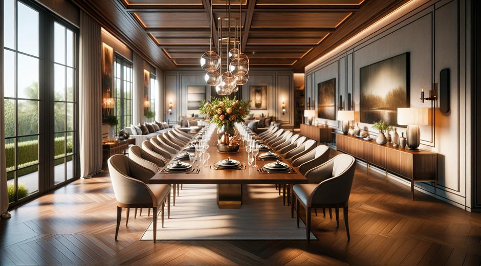
At its core visual balance refers to the distribution of visual weight within a space. Visual weight is not about actual mass but about how heavy an object appears in a composition. A large dark sofa can carry as much visual weight as a cluster of smaller lighter pieces. Achieving balance means arranging elements so that no single area dominates unless you intend it to be a focal point. Balance can be symmetrical where matching elements mirror each other across an axis or asymmetrical where different elements counterbalance each other through contrast color texture and scale.
Why visual balance matters for property appeal
Buyers and renters make quick judgments about spaces. A balanced room reads as tidy thoughtful and usable. It suggests a clear layout and helps people imagine themselves living in the property. On the other hand a room that is visually off balance may feel chaotic small or awkward even when square footage is generous. For real estate listings and staging projects visual balance can directly influence perceived value time on market and the emotional response of viewers during visits. Using balance effectively turns standard photos into compelling showcases and opens up new possibilities for diverse audiences.
Key principles of visual balance interiors
There are a few reliable principles that guide successful balanced compositions inside homes.
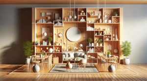
Symmetry where matching pairs create a calm and formal feel. This works well in living rooms with two identical chairs flanking a fireplace or in bedrooms with matching night tables.
Asymmetry where balance is achieved with unequal but complementary items. For example a large sofa paired with a floor lamp and a pile of books can feel balanced if the visual weights align even when sizes differ.
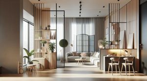
Balance by color where hues are distributed across the room to create cohesion. A bold color can be balanced by repeating it in smaller accents on the opposite side of the room.
Balance by texture where rough and smooth finishes counter each other creating interest without visual overload. Think woven rugs against sleek wood floors.
How to assess visual weight
Understanding what makes an object carry visual weight helps you make smarter choices. Factors that increase visual weight include saturation of color darker tones complex patterns dense texture and size. Placement also matters because items placed near the center of a room or at eye level will draw more focus than items tucked into corners. Test balance by imagining an invisible fulcrum at the center of the room and asking if elements on each side feel balanced. Move pieces or add accents until the scene reads harmonious.
Practical tips for creating balanced interiors
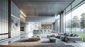
Start with a focal point. Anchoring the design around a single focal point like a fireplace a large window or an artwork simplifies balance decisions. Arrange furniture and accessories to support that anchor rather than compete with it.
Group smaller items. A set of objects can create balance when clustered. A trio of vases or a stack of books can equal the visual weight of a single larger object.
Use repetition to tie spaces together. Repeating a color a material or a shape in multiple places helps distribute visual weight and increases harmony.
Mind scale and proportion. Avoid tiny furniture in large rooms or bulky elements in tight spaces. Scale affects perceived balance more than price or style. A well proportioned lamp on a side table helps create equilibrium even in a mixed style setting.
Layer lighting. Mixing overhead lights table lamps and floor lamps balances brightness and shadow. Proper lighting reduces heavy dark areas that can make a room feel off balance.
Color texture and pattern strategies
Color is a powerful tool. Dark saturated colors grab attention while light colors recede. To balance a dark sofa place lighter accessories on the opposite side of the room and consider reflecting light with mirrors or metallic finishes. Texture adds depth. If one area has a lot of soft textiles balance it with harder surfaces elsewhere. Patterns are high in visual weight so if you choose a patterned rug balance it with solid colored upholstery or coordinated pattern accents placed at a distance.
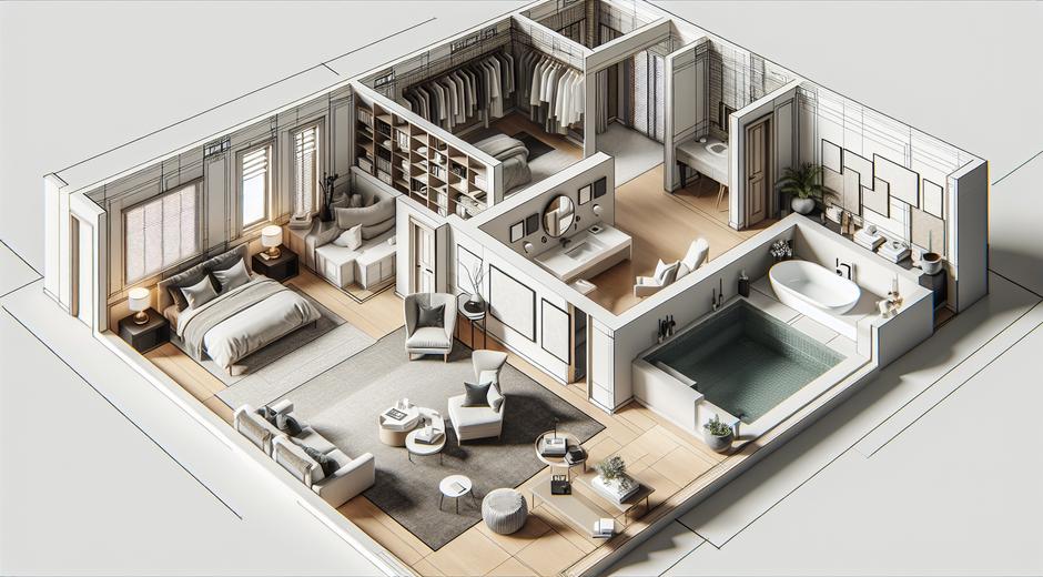
Layout and circulation considerations
Balance is not only about objects but also about movement. A room with clear flow feels balanced because the eye follows predictable routes. Leave adequate space around furniture for circulation and orient seating toward focal areas. In open plan designs create visual anchors for each zone to avoid visual competition between areas. Rugs artwork and lighting can carve out distinct balanced zones within a larger space.
Staging tips to maximize listing appeal
When preparing a property for market focus on neutral backgrounds with balanced accents that appeal to broad audiences. Remove excess clutter and keep furniture that shows the room function clearly. In living rooms align seating to show conversation and sight lines. In bedrooms create symmetry at the bed with matching tables or complementary items. Small and affordable adjustments like swapping a lamp repositioning a rug or adding a plant can dramatically shift the balance and the resulting perception of the space.
Examples of balanced transformations
A narrow living room can feel wider when a long sofa is balanced by art and lighting on the opposite wall. A large open kitchen can gain a sense of intimacy when a dining table and pendant light create a visual counterpoint to the island. In each case the goal is to distribute focus so the eye moves comfortably and the space reads as intentional.
Bringing modern trends into balance
Current design trends favor layered minimalism natural materials and mixed metals. These trends work well with visual balance because they emphasize quality pieces curated for cohesion. When combining modern elements keep balance in mind by mixing warm texture with cool metals and repeating key tones across the room. For tech forward homes consider how screens and speakers affect visual weight and integrate them into balanced compositions rather than letting them dominate the scene. For additional context on how media and lifestyle trends influence design choices see insights at GamingNewsHead.com which often covers lifestyle technology and its role in home environments.
Measuring success and testing layouts
Take photos from multiple angles to evaluate balance. Sometimes the camera reveals imbalances the eye misses. Ask neutral viewers which area draws attention and whether any corner feels empty or overloaded. Iterate by moving one element at a time until the composition flows. For listing photography always stage for the camera because most viewers encounter the property first through images.
Conclusion
Visual balance interiors is an achievable aim that lifts the perceived quality of any property. By understanding visual weight symmetry asymmetry color texture scale and circulation you can design spaces that feel attractive functional and market ready. Whether you are styling a single room for sale or advising clients on a full renovation these principles provide a reliable framework for decisions. Start simple focus on focal points repeat key elements and test with photography to refine your approach. Balanced rooms not only look better they feel better and that is a key element in winning interest and building value.